Hello and welcome students. Take a seat, get your cameras/phones/photo-taking devices out, and let’s get started.
If you’ve been playing along with photo-a-day for a little while now, you’ll know that each month I share a photography technique as a prompt. It gives us all a chance to grow, stretch and explore a little more with our photos. Some are harder than others, and some are ones that I use all the time. Some I’d never used at all {macro, I’m looking at you!}. Today it’s one of my favourites, the rule of thirds.
Once you use this a few times, it will probably change the way you compose a photo. It can seriously make or break a good photo, and I’m so excited to be sharing about it. First let me tell you a little more about it. What is the rule of thirds?
The rule of thirds is a “rule of thumb” or guideline which applies to the process of composing visual images such as designs, films, paintings, and photographs. The guideline proposes that an image should be imagined as divided into nine equal parts by two equally-spaced horizontal lines and two equally-spaced vertical lines, and that important compositional elements should be placed along these lines or their intersections.
What was that noise? Did I just hear your brain explode? Don’t worry, I’m going to explain this to you like you’re a 6 year old who has just had too much red cordial at a birthday party. We’ll get there.
Let’s start simple
Let’s start with a subject matter that doesn’t move. So let’s pack away the kids and animals for a moment and just ease our way into it. Let’s start with a skyline.
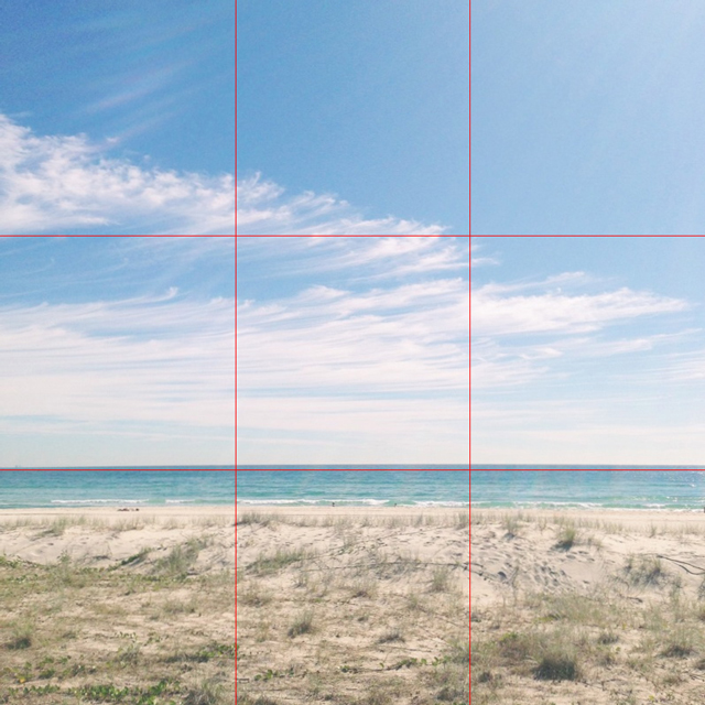
As you can see below, the photo is basically broken into 9 equal parts. If you’re using an iPhone {not sure if this is available on other smart phones} you’ll see this grid when you’re taking a photo using the phone camera. The rule of thirds ideal is that you’d place anything of interest {i.e. your subject matter} at any of the intersections of the grid {where two lines meet} or along/on any of the lines.
Here I’ve placed the skyline on the bottom line of the grid. If I’d placed the skyline right in the middle it would have had a different visual effect.
If your camera or phone doesn’t have the grid as you’re taking a photo, just imagine it. Move the subject matter to one of the thirds of the frame. Take a few photos so that you can decide afterwards which works best. Also, if you’re using an editing App like Camera+ you can crop the photo later and figure out the best rule of thirds then.
And now, let’s get a little more complicated. But not much.
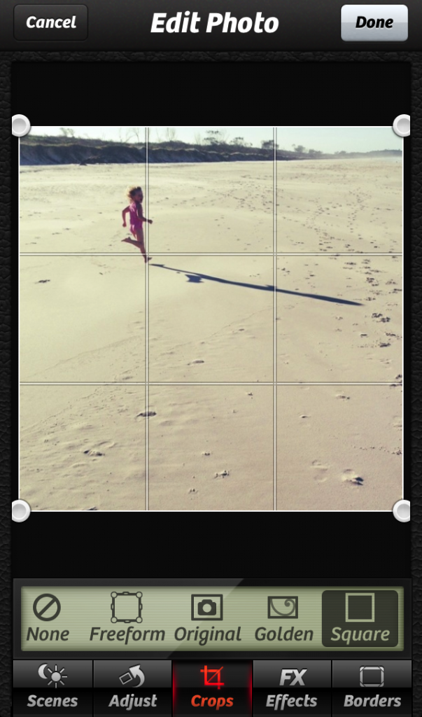
Now I’ve thrown a small child into the mix. Dangerous. Well, not really, but not as simple as a skyline. I’ve placed Lacey where two of the rule of third lines meet.
Note: I didn’t stress over the placement of her when taking the photo. I kept her roughly to the left-hand side, but then cropped it to how I wanted afterwards. We have a little bit of flexibility with smartphones and editing programs.
The point of interest of your photo should be what you place in that rule of thirds area, whichever you choose. It could be a person’s eyes, a tree in a landscape, a building, a person, an animal… whatever it is that you’re shooting.
Lastly, abiding by the rule of thirds doesn’t mean that it’s the only way to take a photo. This is just a very traditional technique used in photography and art, and if you break the rules you can still end up with a stunning photo.
If you’re still not sure if you understand this technique, I wrote a more detailed post a while ago that you might like to read. Check it out here.





Ok, I hope this doesn’t sound really stupid, but are you saying that the subject of my shot should be in the same area where you have Lacey? I have never heard of this technique so I put the grid on my phone and will start using it.
this is exactly what i am looking for! very helpful.
thank you!
– Janine
http://theeoptimist.blogspot.com
having the grid turned on is a huge help!!! when I discovered (or rather was taught) the rule of thirds several months ago, I immediately turned on the grid on my iPhone’s camera, and I haven’t turned it off since. I also noticed an immediate improvement in my pictures. I’m biased, naturally (lol), but still… 🙂
Great piece. Thanks. (member of “Photo a Day using Fat Mum Slim.)
Found this useful. Keep telling us more. I like the visual examples, as well. I take “okay” photos and do want to improve.
ER-MAR-GARD!!!!!!!! Thank you so much for sharing this technique.
Great help, thanks. I do like a photo tip.
i love the rule of thirds. it does the trick most of the time and turns an “average” picture into a more unique one.
Roni, you can use any intersection, or one of the nine squares as your focal point.
It gives the photo structure and is easier on the eye.
The background should, ideally, be divisible by three to give balance, with the focal object following the RoT.
Good luck.
Thank you!!
Thanks for the little reminder that there is more to making a good pic work that just point and shoot. More clever tricks like this please, in the event of you having spare time on your hands…..perhaps a baby pic tutorial next?
Holy God Fathers! I still don’t get it! May have to give Dy 21 a miss #blonde #dumb
http://29yearoldmama.wordpress.com
Holy God Fathers! I still don’t get it! May have to give Day 21 a miss #blonde #dumb
http://29yearoldmama.wordpress.com
Just an FYI for those with a Samsung (I have s4 but assume they’re all similar), to get the grid lines: open the camera and select the settings cog, then tap the settings cog a second time until the menu appears in the centre of the screen. There’s a camera, a video recorder and the settings cog across the top of the menu box. Tap the settings cog and move down to ‘Guidelines’ and select ‘on’.
I’m not sure I completely understnad the technique but I’m looking forward to trying it out!
Hah! I’ve had my iphone for 2 years, have seen that grid on my camera but never bothered to find out why it was there! Thank you for the lesson, Chantelle :). I’m looking forward to trying this technique!
Love this. Clear as crystal. Thanks!