What a year it’s been. If you’ve been playing photo-a-day from the beginning you’re almost ready to round-up a whole 365 of photos. That’s a lot of fun right there in pictures. Good work you. If you’ve just jumped on board this month, or in recent months, go you too. Good stuff.
For a good part of this year I’ve included a photography technique in the monthly prompts so we can stretch and grow a little and learn a bit more about photography. So far we’ve explored:
♥ Negative space
♥ The rule of thirds
♥ Perspective
♥ Simplicity
♥ Depth of field
♥ Macro
And now we move onto composition…
Composition is about being mindful of your subject matter and where you place it in a photo. It’s about taking a moment before hitting the button to compose your photo, placing it right where you want it. Kinda like the people that take the Santa photos, they’re always making sure your kids and the man in the big red suit are front and centre, right?
Four composition tips for taking better photos
One.
Use the grid on your phone or camera. Once you start using the grid, you won’t stop {well, I can’t}. The gridlines are two horizontal and two vertical lines that appear on your screen, breaking your screen up to nine pieces. It makes composing your photo so much easier.
Two.
One of the best ways to compose your photo, is using the Rule of Thirds. It’s not so much a strict rule, but a suggestion for composing your photo. I wrote about it here and here.
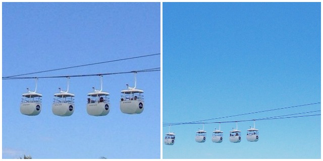
Check out the photos above. The one on the left isn’t observing the rule of thirds. The subject matter is smack-bang in the middle of the frame. In the photo on the right I’ve positioned the subject matter in the lower third {and implemented some negative space too} to make it a little more interesting.
Three.
Play around with perspective.
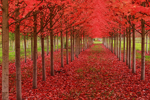
photo credit: Ian Sane
See how in the photo above that when you look at it your eyes follow the tree lines and go to the back of the garden. That’s perspective for you. The photographer has composed the photo so this happens. They’ve thought about where they should stand to make the perspective work best. Didn’t they do a fan-dangle job? Find more perspective tips here {including fun forced perspective ideas}.
Four.
Give negative space a chance. Negative space is a sweet way to compose your photo easily. Particularly on Instagram, we have such a small canvas to work on. By taking out all the distractions and letting your subject matter be the star of the photo, you really are creating wonders. I’m a huge fan of it.
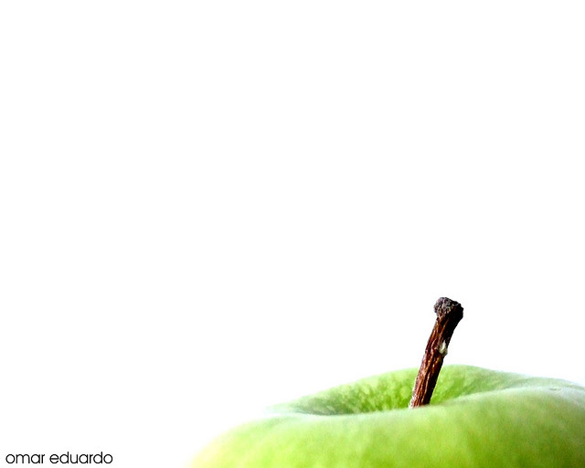
photo credit: Omar Eduardo
With the photo above, it would be easy to have your normal background with the apple as your subject matter. And by normal background I mean the kitchen bench, the fruit bowl, the toaster and the breakfast scraps your forgot to clean up as well. But instead you pick up your apple and you place it on a side table against a white wall and you take the photo there. There are no distractions, it’s just the apple being the star of the show.
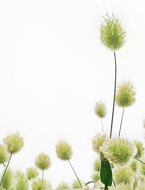
photo credit: tanakawho
Above is another example. Instead of standing up and looking down at the ground and taking the photo, the person has got down low to let the sky act as negative space. It’s just a matter of thinking differently.
I hope this helps give you some ideas for composition. I can’t wait to see what you create!





I am going to practice these ,thankyou for the tips x
Thank you, Merry Christmas!
This may also be helpful! http://www.digitalcameraworld.com/2012/04/12/10-rules-of-photo-composition-and-why-they-work/
Sweet thanks for these tips. I must say I’ve had a ball coming up with new photos everyday.
Love these tips!
I lov your tips Chantelle! We can always learn more about how to take a good photo!
love these tips- going to try the rule of thirds tomorrow and see what happens 🙂
Gosh the apple one is cool, I must try remember this! x
As always, I love it when you share these tips. You’ve helped me become a better photographer. I’ve still got a long way to go to be anywhere near as good as you, but I’m sure having loads of fun practicing! x